
Scripting with SwiftUI (III) - Forms
Tutorial13 June 2021
This tutorial is the third one of the series "Scripting with SwiftUI". This series goal is to use SwiftUI in Swift scripts that can be easily shared. As this use case is more common for Mac admins, those tutorials are addressed to this audience. Noneless a Swift developer could find interesting techniques in those tutorials.
If you have not already done it, I advice you to follow the first two tutorials Coding a color picker view and Scripts provider which explain SwiftUI knowledge required for this tutorial.
Exposition
In this tutorial, we’re going to implement a simple form to ask some (very basic) information to the user. Then, we’ll see how to export those information with the Codable protocol in a JSON file. This can be useful to send this file to a remote server or to store it for a later use. The last part is optional and deals with data validation and how to show warnings to the user.
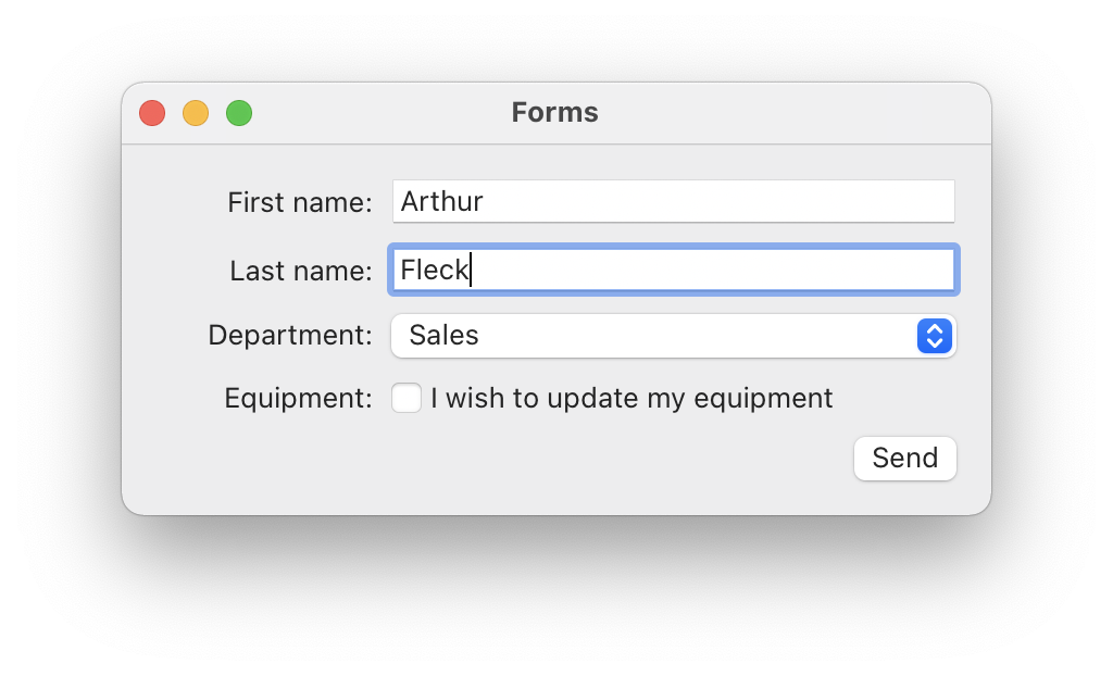
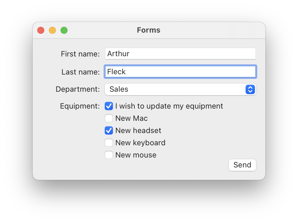
Here are some screenshots.
The equipment boxes list appears only when the box "I want to update my equipment" is checked.
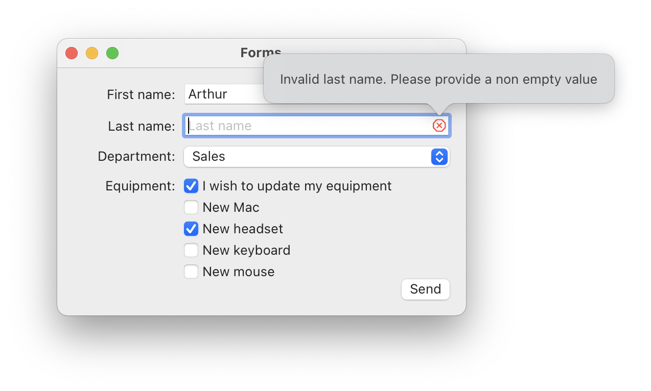
In the last optional part, I'll show how to implement validation on the form. When the "Send" button is clicked and one of the text field is empty, a cross icon appears, and a popover is shown when hovering the cross.
Quick project overview
You can find the materials for the tutorial here. Open the starter project, you should see some code already present and which is similar to the one written in the previous tutorial. Here is a quick overview:
- Constants: the properties that will be used in the overall script.
- Models: that's where the data models to be used in the script will be implemented.
- Views: as for the previous tutorial, this section will contain the views. For now, it only contains the
MainViewthat will be used to gather all the views in one. - Setup: this last part is the same as the previous tutorial and holds the logic to start the interface in the script.
Building the form
The models
With the screenshots above, it’s possible to guess how the properties we are going to export will be stored. What we will need:
- A
Stringproperty for the first name - A
Stringproperty for the last name - A list of possible values for the department. For this tutorial, we’ll go for an
enum. - For the equipment, we’ll need a custom
structto store which boxes are checked.
struct would be ok. Here however, the modifications of those properties should have an impact on the view. For instance, checking the box "I wish to update my equipment" should show the equipment list. Also, if the properties were retrieved from a file (as the one we are going to export), the properties values should be reflected in the UI.
In short, we are going to use an
ObservableObject with
@Published properties.
ObservableObjectis a protocol. If you do not know what a protocol is, you might want to read my explanation in the previous tutorial.- An
ObservableObjectis a class whose@Publishedproperties changes can be observed.@Publishedis part of Combine, and SwiftUI automatically handles that for us. By implementing one, we get a SwiftUIViewupdating when any object’s published properties is modified.
Let’s start with the easy properties: first and last name. The model will be named Infos and will be a class conforming to ObservableObject. You can add it right below the MARK: - Models delimiter.
// MARK: - Models

final class Infos: ObservableObject {
    @Published var firstName = ""
    @Published var lastName = ""
}
We could use optional properties (and this would be clearer), but we are going to need them in a TextField view which takes a non-optional String (wrapped in a Binding).
For the "Department" list, an enum is a good choice for this tutorial since it will store a finite amount of values that we will be able to browse by adding a conformance to CaseIterable. Here it is.
enum Department: String, CaseIterable {
    case sales = "Sales"
    case it = "IT"
    case marketing = "Marketing"
    case communication = "Communication"
}
As mentioned, the conformance to CaseIterable allows to call the property Department.allCases which will yield the following array.
[Department.sales, Department.it, Department.marketing, Department.communication]
As the enum declare String raw values, a simple map can transform the array of Department into an array of String:
Department.allCases.map(\.rawValue)
// prints ["Sales", "IT", "Marketing", "Communication"]
A department property can now be added to the Infos class. The default value is arbitrary set to Department.sales and will appear as the default option in the department list control.
final class Infos: ObservableObject {

    @Published var firstName = ""
    @Published var lastName = ""
    @Published var department = Department.sales
}
For the equipment part, we will first add an equipmentUpdate property to specify whether the equipment checkboxes should appear, then an equipment property will store which equipment box is checked. To do so, the Equipment struct is implemented.
struct Equipment {
    var mac = false
    var headset = false
    var mouse = false
    varkeyboard = false
}
Now the Infos class can be completed.
final class Infos: ObservableObject {

    @Published var firstName = ""
    @Published var lastName = ""
    @Published var department = Department.sales
    @Published var equipmentUpdate = false
    @Published var equipment = Equipment()
}
By default, the equipmentUpdate property is false, meaning that the box "I wish to update my equipment" will be unchecked. The same goes for the equipment list boxes.
Now, we are ready to build the interface. Let’s craft a bit!
Building the UI
As usual in those tutorials, the MainView will be the root view, holding all the other ones. Thus, it makes sense to make it the owner of the Infos property that the sub-views will share and modify. So, before coding the form rows, please add the following to the MainView, above its body property.
struct MainView: View {

    @StateObject var infos = Infos()

        var body: some View {
            // ...
    }
}
Wait… what is @StateObject now? As if we did not have to handle several property wrappers in SwiftUI 🙄
Yes, it’s another property wrapper to remember, but it’s for our own good, trust me! In the previous tutorial, we used @EnvironmentObject which is more convenient. It allows any subview to access to the instance passed to one of its parent with the environmentObject modifier. It would be fine to use it for this tutorial but I wanted to show another way. By declaring a @StateObject in the MainView, we specify that the MainView owns the infos instance, and is responsible for creating it. Then, subviews that need to access to the infos instance will declare an @ObservedObject, which will be passed in the init. This is more restrictive because it forces us to pass it every time it’s needed. But it’s also clearer because we know what view needs it.
If we were to implement a deeper view hierarchy with some views needing to access to infos, and some others not, an @EnvironmentObject would be a better choice than @ObservedObject. Anyway, the MainView would still have to declare a @StateObject since it’s the one creating it.
After this SwiftUI theory, it’s time to code the form rows!
Name rows
Let’s start with the first two text fields. They are exactly similar, so we will implement only one View that will be reused. Here, they are two views that are stacked horizontally. Thus, we are going to put them inside in a HStack this time. The view on the left simply displays text, so a Text view should be enough. The right is new though really simple. It’s a TextField with a placeholder. Thanks to SwiftUI, implementing those views is easier than with AppKit.
Here is how the Name row looks like. You can add it below the MARK: - View delimiter.
struct NameRow: View {
    // 1
    @Binding var value: String
    let label: String

    var body: some View {
        HStack {
            // 2
            Text("\(label):")
                .frame(minWidth: labelsWidth, alignment: .trailing)
            // 3
            TextField(label, text: $value)
        }
    }
}- The value of the text field is declared as a
Binding. If you remember the last tutorial, this indicates that the view should receive a link to an initialStateproperty. Here, the property will be$infos.firstNameor$infos.lastName. When dealing with a@StateObject, one of itsPublishedproperty can be passed as aBinding. Thelabelproperty is used for theTextview. - The
Textview could adapt its width to give more or less space to theTextField. As it’s nicer when everything is aligned, we will give all labels on the left a minimum width and make them aligned on the trailing side (right for left to right language). ThelabelsWidthis a constant declared in the top of the file and equals a quarter of the window’s width. - The
TextFieldis really straightforward. It takes a placeholder as aStringProtocol(like aStringbut more generic), and a binding to a value that will be the one entered by the user.
To use this new NameRow, please replace the MainView.body property with the following.
Form {    // 1
    VStack { // 2
        // 3
        NameRow(
            value: $infos.firstName,
            label: "First name")
        NameRow(
            value: $infos.lastName,
            label: "Last name")
        }
    }
}
- SwiftUI offers a very nice way to declare views that acts as a form. Using the
Formstruct to wrap our form rows, we get many features for free , likeSectionto declare sections or visual elements like grouped table views in iOS. I do not find this to be on macOS in this tutorial, but as SwiftUI is cross-platform, it’s good to be able to export this view to iOS or iPadOS one day. - As you might have guessed already, the form rows will be packed in a
VStack. As we use aForm, this is not required, since it already accept a list of views. But it’s the simplest way I found to properly align controls in the « macOS way » - The two
NameRowsare declared here, and receive theinfosinstance first and last name properties. Thus, when the user will enter some text in the text fields, the properties that will be modified will beinfos.firstNameandinfos.lastName. Great!
You can already run the project to see the window appear with the two name rows.
And we’re just warming up!
Department row
The department row should display a list of the possible departments the user can choose from. If you remember the first tutorial, we used something similar to choose a color. In SwiftUI, this is called a Picker. It will take a value to update (so here a Department), a label to be displayed next to the selection, and a list of values that can be selected (here, our Department cases).
Here is the implementation.
struct DepartmentRow: View {
    // 1
    @Binding var department: Department

    var body: some View {
        Picker(
            selection: $department, // 2
            label:
                Text("Department:") // 3
                    .frame(minWidth: labelsWidth, alignment: .trailing))
        {
            // 4
            ForEach(Department.allCases) { department in
                Text(department.rawValue).tag(department)
            }
        }
    }
}- As for the
Namerow, theDepartmentRowwill receive aBindingto indicate which property of theinfosinstance has to be used for the picker value. We will passinfos.$departmentwhen declaring it in theMainView. - The picker
selectionparameter takes a binding, so here the binding$departmentis provided. - The picker label is set to have a minimum width, as for the
NameRowlabel, so that labels are properly aligned. - To specify the values in the picker list, a
ForEachstructure is used. We provide it theDepartment.allCaseslist. Then for each department, a simpleTextview is used to display the department name. Thetagmodifier is use to uniquely identify theTextview and to associate it to the properDepartmentvalue to update the picker value (thedepartmentproperty).
If everything went fine, the compiler should complain (but its fine 😉). The problem is that a ForEach structure works with Identifiable types. In the first tutorial, we used integers to feed the ForEach, which already conforms to Identifiable. But here, we have to do it ourselves. Fortunately, it’s quite easy. If we look at the Identifiable requirements, there is only one:
protocol Identifiable {
	associatedtype ID: Hashable
	var id: ID { get }
}
To make the Department type Identifiable, we have to add the Identifiable declaration and a property named id which has a type conforming to Hashable. This might seem complex at first, but it’s easier done than said. Here is how.
enum Department: String, CaseIterable, Identifiable {
    case sales = "Sales"
    // other cases ...

    var id: String { rawValue }
}
Now the compiler should be quiet and we can add the new department row to the MainView right after the second NameRow.
Form {
	VStack {
		// other views
		NameRow(
			value: $infos.lastName,
			label: "Last name")
		DepartmentRow(department: $infos.department)
	}
}
You can now run and select the department.
Equipment row
The equipment row will display the checkbox to select some equipment, as well as the equipment items list.
To do so, it will need to access the infos.equipmentUpdate and the infos.equipment properties. If it’s possible to use Bindings again, it’s a good opportunity to use an ObservableObject.
The views will be inside a VStack. The equipment checkbox is quite simple to implement, whereas the equipment checkboxes will require a bit more work.
struct EquipmentRow: View {

    // 1
    @ObservedObject var infos: Infos

    var body: some View {
        VStack(spacing: 5) { // 2
            HStack { // 3
                Text("Equipment:")
                    .frame(minWidth: labelsWidth, alignment: .trailing)
                Toggle(isOn: $infos.equipmentUpdate) {
                    Text("I wish to update my equipment")
                }
                Spacer()
            }
            // 4
            if infos.equipmentUpdate {
                // to be filled
            }
        }
    }
}- The
infosproperty is an@ObservedObjectand will be provided by theMainView. - The vertical stack holding the rows has a spacing of 5 to ventilate the layout.
- The checkbox to choose to update the equipment is declared. It’s a
HStackthat displays the label on the left, aToggle(the checkbox on macOS) with a custom label, and a spacer to push the toggle on the left. The toggle will update theinfos.equipmentUpdateflag. - It’s possible to use branchements in SwiftUI. Even if it’s limited compared to Swift (it’s not the same
if), it is quite powerful yet. It allows us to show the equipment checkboxes list only when theinfos.equipmentupdate is set totrue. This is interesting to show the list only when the user asks for it.
When to prefix with $?
You might have noticed that the equipmentUpdate binding is not prefixed with $ and it's rather the infos object that is. It does not seem intuitive, although there is a reason to explain that. Prefixing equipmentUpdate with $ specifies that we want to access the projected value of the @Published property Infos.equipmentUpdate. That is, a Published value. But this is not a Binding. Thus, it cannot be passed to the Toggle initializer. The solution provided by Apple is to rather prefix the observed object with $ to access the projected value of @ObservableObject. Which is, to quote the doc: « A wrapper of the underlying observable object that can create bindings to its properties using dynamic member lookup. ». So the value returned by $infos allows us to specify a property for which we want to get a Binding. For instance $infos.equipmentUpdate to get a Binding for the equipmentUpdate property.
To display a checkbox with the name of the equipment the usr can select, we will implement a new view called NewEquipmentRow. As mentioned in the previous tutorial, SwiftUI encourages views composition. As the view to display the equipment makes 15 lines it’s a good idea to move it away from the EquipmentRow.
The NewEquipmentRow will display only a checkbox with a label on the right to indicate the equipment name. Also, it will require a Binding to know if it should be checked. The binding will be provided by the EquipmentRow using the infos object.
Here it is.
struct NewEquipmentRow: View {

    // 1
    let text: String
    @Binding var isOn: Bool

    var body: some View {
        HStack {
            // 2
            Text("")
                .frame(minWidth: labelsWidth)
            // 3
            Toggle(isOn: $isOn) {
                Text(text)
            }
            Spacer()
        }
    }
}- The
textproperty will be the label on the right of the checkbox. The bindingisOnwill be provided by theEquipmentRowview. - To make the checkboxes aligned with the first one (and the rest of the controls of the form), a little trick is used here. We declare a
Textview with an emptyString, but with the same minimum width as the other labels above. A cleaner option would be to use aSpacerwith aGeometryReaderbut this is beyond the scope of this tutorial. - The
Toggleis declared, followed by a spacer to push it to the left.
Now, we can fill the equipment update list. Please remove the comment and replace it with the following.
NewEquipmentRow(text: "New Mac", isOn: $infos.equipment.mac)
NewEquipmentRow(text: "New headset", isOn: $infos.equipment.headset)
NewEquipmentRow(text: "New keyboard", isOn: $infos.equipment.keyboard)
NewEquipmentRow(text: "New mouse", isOn: $infos.equipment.mouse)
The final EquipmentRow should look like this.
struct EquipmentRow: View {

    @ObservedObject var infos: Infos

    var body: some View {
        VStack(spacing: 5) {
            HStack {
                Text("Equipment:")
                    .frame(minWidth: labelsWidth, alignment: .trailing)
                Toggle(isOn: $infos.equipmentUpdate) {
                    Text("I wish to update my equipment")
                }
                Spacer()
            }
            if infos.equipmentUpdate {
                NewEquipmentRow(text: "New Mac", isOn: $infos.equipment.mac)
                NewEquipmentRow(text: "New headset", isOn: $infos.equipment.headset)
                NewEquipmentRow(text: "New keyboard", isOn: $infos.equipment.keyboard)
                NewEquipmentRow(text: "New mouse", isOn: $infos.equipment.mouse)
            }
        }
    }
}
We can now add it to the MainView below the DepartmentRow.
struct MainView: View {

    @StateObject var infos = Infos()
    @State private var showAlert = false var body: some View {
        Form {
            VStack {
                NameRow(
					value: $infos.firstName,
                   label: "First name")
                NameRow(
                    value: $infos.lastName,
                    label: "Last name")
                DepartmentRow(department: $infos.department)
                EquipmentRow(infos: infos)
            }
        }
    }
}
If you run the app, you should be able to check the equipment boxes and then check each piece of equipment box.
Send button
The last touch for this UI is to add a "Send" button that will save the user’s inputs and close the window. We already used buttons in the previous tutorials, so I’ll just put the implementation with some comments. Please add this right below the EquipmentRow(infos: infos) line.
HStack {
    // 1
    Spacer()
    // 2
    Button("Send") {
        // 3
        // TODO: save infos
        // 4
        NSApp.terminate(nil)
    }
}
- To align the button on the right in the form, a
HStackis used with a spacer. - The button is declared with a title and function to execute when it is clicked. Right now it only terminates the app, but we are going to implement the inputs saving in the next section.
- We will replace this comment with the user’s inputs export when it is implemented.
- To close the app window and terminate the app, we invoke
NSApp.terminate(_:)
When running the app, you should have a UI similar to the first screenshots shown (except for the one with the validation warnings). When you click the « Send » button, the window should close and the app terminate.
It’s time to take a break! In the next section, you are going to get to know the powerful Codable protocol to save the user’s inputs.
Save the user’s inputs with Codable
A bit of theory
As we want to save the user’s input to a JSON file, the best solution in Swift is to work with the Codable protocols. When we want to export an object to a specific format, we can use the Encodable protocol. By making the object’s type implementing this protocol, we describe how we want the object to be transformed to the other format. If it’s commonly used for serialization, like saving to a JSON or Plist file, the Codable protocols can be used in other cases. For instance, it’s used by the Swift on server framework Vapor to provide information to a web page. With Scout, it allows to transform any type to an ExplorerValue.
In this tutorial though, we will keep things simple and only use features offered by the Encodableprotocol.
The counterpart of Encodable is Decodable and is used to describe how a type should be transformed from another format. The Codable protocol is only a type alias to group both Encodable and Decodable protocols:
typealias Codable = Encodable & DecodableTo transform an Encodable type to another format, we have to use an Encoder. This object will hold all the logic to make the transformation, as long as our type conforms to Encodable. For instance, we can use a Coder to transform an Encodable type to a JSON format, but we can also use another Coder to transform it to a Plist format, Yaml… The huge benefit of the Codable protocols is that we only have to describe how our type should be transformed from and to another format. Then any Encoder (or Decoder) can be used to effectively make this transformation.
For this tutorial, we want to export the Infos value to a JSON file. So we should use an Encoder that transforms an Encodable value to a JSON format. Fortunately, the Swift standard library comes with such a tool: JSONEncoder. If we rather were to decode, we would use JSONDecoder.
Similarly for the Plist format, the PropertyListEncoder and PropertyListDecoder are available in the standard library.
Encoding in practice
To encode a custom type like Infos, Swift offers several levels of freedom/complexity. When it’s possible, the compiler will automatically encode (or decode) a custom type for us, without further effort. For instance with a struct that only has Encodable properties, the compiler is able to know how to encode. Demonstrating all the possibilities to encode and the subtleties of the Codable protocol is beyond the scope of this tutorial. This page from the Apple documentation provides more details.
It’s also worth to say that we do not really have a choice in the method to use here. Because we want to encode an ObservableObject with @Published properties, we can’t rely on the compiler to generate the logic for us. We have to do it the hard way 💪
Don’t worry though, it’s not that complicated. And choosing the hardest path is a good opportunity to better understand the logic that the compiler would generate for us when possible.
The Codable protocols works with another one to uniquely identify properties: CodableKey. Most often, this protocol is implemented by aString enum defined in the type itself. So please add a new extension of Infos (below the class declaration closing curl bracket) with the following content.
extension Infos: Encodable {

    enum CodingKeys: String, CodingKey {
        case firstName, lastName, department, equipment
    }
Do note that the equipmentUpdate property is not specified, since exporting the equipment property is enough.
By doing so, we let the compiler know what names to use to encode (or decode) the properties of our Infos type. It might be enough if we were not dealing with @Published properties.
Unfortunately, the compiler accepts that we only declare the properties names when those properties are Encodable (or Decodable). Here, since we use the @Published property wrapper, the compiler is unable to understand how to encode the Infos properties. Maybe one day Apple will add this feature for us (making a Pusblished structure Codable when its wrapped value is Codable), but until then, we have to implement the logic ourselves. Thus please add the following function to the extension.
// 1
func encode(to encoder: Encoder) throws {
    // 2
    var container = encoder.container(keyedBy: CodingKeys.self)
    // 3
    try container.encode(firstName, forKey: .firstName)
    try container.encode(lastName, forKey: .lastName)
    try container.encode(department, forKey: .department)
    try container.encode(equipment, forKey: .equipment)
}- The
Encodableprotocol requires the functionencode(to:)function. As mentioned, the compiler will implement it for us when possible. Here, we declare that we implement it. The function can throw an error because encoding a property can fail, as denoted by all thetrystatement below. - To encode a specific group of properties, for instance all the properties of an object, the
Codableprotocols offer containers objects. Here we ask theencoderacontainerthat is "keyed" by theCodingKeysenum we declared. Such containers most often correspond to dictionaries and rely on theCodingKeyto act as their keys type. Similarly, it’s possible to ask for anunkeyedContainerthat will rather correspond to an array. As this operation might fail with an error, we have to use atrykeyword to make sure we are aware of that. If an error was thrown, the code below would not be executed and the function will exit with the error (allowing the calling code to know that the encoding failed and why). - For each property of the
Infosobject, we make the container encode it using the propertyCodingKeysvalue. This way, the container will register the current value of the property with the name we provided in the enum.
So now, with all this work, the compiler should be happy, right?
No! It’s still complaining 😠
The thing is that the compiler already knows how to encode simple types like String or Int. But for the other custom types involved in the Infos class like Department or Equipment, there is no way for the compiler to encode them yet. Thus, it’s required that we make those two types conforming to Encodable. Fortunately enough, we can rely on the compiler doing the work for us this time as mentioned above. The compiler is smart enough to know how to encode them with the implementation we chose. It just requires us to clearly states those types as Encodable. So please add the Encodable protocol in the types declaration.
enum Department: String, CaseIterable, Identifiable, Encodable {
// ...
struct Equipment: Encodable {
Now - at last - the compiler should be happy. And we are ready to export the users’s input to a JSON file.
Export the inputs
The logic to export the inputs will be implemented inside a function named export(to:). Please add it inside the Infos class.
// 1
func export(to path: String) {
    // 2
    do {
        // 3
        let encoder = JSONEncoder()
        // 4
        encoder.outputFormatting = .prettyPrinted
        // 5
        let data = try encoder.encode(self)
        // 6
        FileManager.default.createFile(atPath: path, contents: data)
    } catch {
        // 7
        print("Something went wrong when exporting the inputs. \(error.localizedDescription)")
    }
}- The function takes the file path where to export as a parameter.
- As explained, the encoding process might fail with an error. By wrapping the code inside a
do {}statement here, we stop the error propagation and print it in thecatchstatement. - The code to transform the value is quite simple. First we create a new
JSONEncoderwhich will transform theinfosinto a JSON data value. - Then, the created encoder is customized. Here, we simply specify that the JSON output should be
prettyPrinted. This will make the JSON file more readable, with a nice identation. - The JSON data is created from the
infosobject. This is where the functionencode(to:)that we implemented will be called by the encoder. This call might throw, so thetrystatement is required. - The JSON data is written at the path provided as a parameter using the
FileManager.createFile(atPath:contents:)function. In case of the file already exist, it will be overwritten. This function can also fail, for instance if we do not have the permission to write to a file. Thus, atrystatement is also required. - If the encoding function or the file creation functions fail, the error is caught here and printed. Logging the error this way can be enough for debugging, but it’s not sufficient to inform the user about the problem. In one of the challenges, you will be asked to show an alert to the user, with a relevant message.
To use this function, we only need to call it in the "Send" button function. Replace the "TODO: save inputs" by the function call.
HStack {
    Spacer()
    Button("Send") {
		infos.export(to: "/Users/Shared/inputs.json")
    }
}
Note that you are free to choose another file path of your preference. Make sure though that you are allowed to write there.
Now, when the “Send” button is clicked, the current inputs should appear in a JSON file at the path you specified.
{
  "firstName" : "Arthur",
  "lastName" : "Fleck",
  "department" : "Sales",
  "equipment" : {
    "headset" : false,
    "keyboard" : false,
    "mac" : false,
    "mouse" : false
  }
}
Hurrah! 🙌
The last part is optional, since this tutorial is quite long already. It will offer a way to perform data validation, and how to show a relevant message to the user. If you are not interested, you can jump to the recap and try the challenge. Otherwise, consider taking a break or coming back to this part in a few days. We already have a nice UI with input exportings, so we can call it a day!
Validating the inputs
When asking the user to fill a form, it’s very common to ensure their inputs is correct. For instance, that a phone number is composed of the proper digits, or that an email address is valid.
In this tutorial, we are going to ensure that the first and last names are not empty. It’s limited but it’s enough for us to see how the UI can be updated to inform the user.
To setup this validation, the work can be split in two distinct tasks:
- First, we have to decide when to show a warning, It’s important to not overwhelm the user with warnings every time they enter an incorrect piece of information. Here, we will rather display a warning only when the user clicks the “Send” button. Moreover, only when the user hover the warning icon will we display the text with an explanation.
- Second, how should we display the warning? They are several possibilities, like an alert, a subtext below the field, and more. Most often, I think it’s better to make the warning appear near the field it’s associated with. Thus, it’s easier to understand where the error can be found. For this tutorial, we will add a small red cross inside the text field that has an incorrect value. When the user will hover the cross, a popover with an explicative text will appear.
Let's start with the logic. Once it will be ready, it will be easier to implement the view. Keep on!
Implement the logic
When the user clicks the “Send” button, it could be useful if the Infos object had a validate function returning a boolean to indicate whether the current infos are valid or not. The button function could then decide to prevent further actions like the inputs export.
So please this function at the end of the Infos class.
func validate() -> Bool {
    // will be completed soon
}
Also, add the function call inside the “Send” Button action function, at the very beginning.
Button("Send") {
    guard infos.validate() else { return }

    // export data
    infos.export(to: "/Users/Shared/inputs.json")
}
This way, if the infos object is not valid, the code to export the inputs will not be called. The compiler should be complaining but don’t worry, we are about to make it happy very soon.
So, what can go wrong in the form? As mentioned above, we will ensure that the first and last name fields are not empty. This will be modeled in the Infos class with two computed properties: isFirstNameValid and isLastNameValid. So please add them to the Infos class.
var isFirstNameValid: Bool { !firstName.isEmpty }
var isLastNameValid: Bool { !lastName.isEmpty }
In the final implementation of this project, the logic of theInfos class is separated into different extensions to make the code easier to navigate through. Feel free to organise your code the way that you find the more readable.
As we are going to need to check whether the names field are valid are valid in several places, let’s add a general isValid property to group them.
var isValid: Bool { isFirstNameValid && isLastNameValid }Now, we can use this value in the validate() function. So please replace comment in the function with this.
func validate() -> Bool {
	return isValid
}
Now, when the user clicks the send button, nothing should happen. That’s great, but it would be better to display the warning to the user. So let’s implement the logic for that. That’s the last part before the UI, I promise!
First, we will need a variable to know whether the warnings should be shown. As mentioned above, the warnings should not appear if the user has not clicked the "Send" button at least once. Otherwise, this might feel overwhelming. So, please add a shouldDisplayWarnings property to Infos in its declaration (extensions cannot contain stored properties in case you tried).
@Published private var shouldDisplayWarnings = falseThe property is private because we will expose other ones to the view. That said, the property is a @Published one because we want the view to update when it is modified.
Now, we can add the final two properties to know if the warnings for each name text fields should be visible. You can add those in the same block that the validation properties.
var shouldDisplayWarningForFirstName: Bool {
    shouldDisplayWarnings && !isFirstNameValid
}

var shouldDisplayWarningForLastName: Bool {
    shouldDisplayWarnings && !isLastNameValid
}
Rather than declaring a computed variable for each property, we could have use key paths here, but it’s out of the scope of this tutorial.
Lastly, we should set shouldDisplayWarnings when the user tries to save the inputs. Thus, the validate function is a perfect spot.
func validate() -> Bool {
    shouldDisplayWarnings = !isValid
    return isValid
}
Whenever this function is called, we change the value of shouldDisplayWarnings which will either allow the warnings to be shown or hidden.
Everything’s ready for the views, so let’s set them up!
Implement the views
To make the red cross appear in the TextField, we will use an overlay modifier. This function takes a View as a parameter and puts it in front of the view it applies to. That’s perfect for our case, and simple to use.
The hardest part here is to implement the view that goes in the overlay. We will use a SF symbol for the cross so this should be simple. However, there are two new features we are going to use: a popover and a gesture recognizer for hovering.
The popover takes a View as its content, so we’ll pass it a simple Text. The hover recognizer takes a function that will be executed when the hovering starts or stops. Here it is with comments.
struct WarningPopover: View {
    // 1
    var text: String
    // 2
    var shouldDisplay: Bool
    // 3
    @State private var showPopover = false

    var body: some View {
        HStack { // 4
            Spacer()
            // 5
            if shouldDisplay {
                // 6
                Image(systemName: "xmark.octagon")
                    .foregroundColor(.red)
                    .padding(2)
                    // 7
                    .popover(isPresented: $showPopover) {
                        Text(text)
                            .padding()
                    }
                    // 8
                    .onHover { (hoverring) in
                        showPopover = hoverring
                    }
            }
        }
    }
}
- The
textproperty will be used for the warning text in the popover - The
shouldDisplayspecifies when the cross should be visible. - To make the popover visible when hovering, a private
Stateproperty is used. - To push the cross at the trailing edge, a
HStackwill hold it as well as aSpacer - Similarly with the equipment list, an
ifstatement is used to make the view visible depending on theshouldDisplayproperty. - The red cross is drawn here using the SF Symbol named “xmark.octagon”. The color is set to red and some padding is added
- The popover is a modifier that applies on the view. It takes a binding boolean value to know when to be presented, and a
Viewto present onHoverallows to specify the function to execute when the hovering changes. It offers a parameter in the function to know whether the view is being hovered or not.
Now that the WarningPopover view is declared, we can add it to the NameRow in an overlay. Add this right below the TextField:
TextField(label, text: $value)
    .overlay(
        WarningPopover(
            text: "Invalid value. Please provide a non empty value",
            shouldDisplay: shouldDisplayWarning)
        )
    )
The compiler should complain, so let’s make it happy. Add the property shouldDisplayWarning to the NameRow view.
struct NameRow: View {

    @Binding var value: String
    let label: String
    var shouldDisplayWarning: Bool
    // ...
Finally, we now have to provide the value for the new property at initialisation in the MainView.
Please remove the lines
NameRow(
    value: $infos.firstName,
    label: "First name")
NameRow(
    value: $infos.lastName,
    label: "Last name")
For the new ones
NameRow(
    value: $infos.firstName,
    label: "First name",
    shouldDisplayWarning: infos.shouldDisplayWarningForFirstName)
NameRow(
    value: $infos.lastName,
    label: "Last name",
    shouldDisplayWarning: infos.shouldDisplayWarningForLastName)
Careful not to mix first and last properties!
When running the app, you should see a cross appear in a text field that has an empty value, and a popover with the warning text when hovering the cross.

We did it!
Recap
A lot of stuff in this tutorial! Building a form interface in SwiftUI, and then using Codable to export the user inputs. Finally, the optional validation part to ensure the inputs are correct.
Possible use cases
Those features could be really useful to offer your end-users a nice way to fill information, and then retrieve them. A survey for your company? You could push your script on your users devices and execute it to ask them to fill the survey.
Explore the controls
We only covered some controls that can be used in a form. Feel free to experiment other ones, or to customise them. For instance, it’s possible to require a specific input in the TextField, like numeric characters only. Don’t forget that with SwiftUI powerful state management, it’s easy to make some parts of the form appear conditionally, like we did for the equipment list.
Codable
If you feel lost with Codable, don’t worry! We did it the hard way since we had no choice. Most often, you can find yourself only adding an Encodable declaration to your type, and rely on the compiler to do the work for you. Doing it manually at least provided an opportunity to understand how it’s done. And if it’s seem complicated, don’t feel lost. It will come with time. If you would like to learn how to rather decode a type, I would advice you to take a look at this tutorial.
Challenges
You can find the solution for the challenges in the Challenges folder.
Export to a Plist format
Difficulty: +
If you prefer Plist files, you can try to use the PropertyListEncoder to encode the user’s inputs to a Plist file rather than a JSON one.
Alert for an exporting error
Difficulty: ++
Currently, if the export of the inputs fails, the error is logged but nothing else, which is a poor user experience.
Add an alert modifier to the MainView to show a proper message to the user, like contacting the support.
Read the user’s input
Difficulty: +++
In this tutorial, we only covered the encoding part. If you are feeling adventurous, you can try to allow to read user’s input from an exported file. You can write a function that will read the content of a file at a specific path (we’ll cover in another tutorial how to read input’s from the command-line). Then the content of the file should be deserialized to an Infos object. You might find those tutorials interesting:
- Apple Doc
- Ray Wenderlich
- SwiftLee
Encoding and decoding are great tools to add to your belt. Especially when it comes to share data. Being at ease with those concepts can really be a valuable skill, while it can be hard to properly master them. Don’t worry if it takes time, and don’t hesitate to ask if you have a question about this topic.
Thanks for reading!